Accessible Google Maps: An Inclusive Design Case Study
Product Design | Accessibility | Inclusive Design | Qualitative Research
Tools Used
Project Scope
My Role
Figma, Map Style API from Google Maps API, Javascript Simulator
4 month project focussed on Color Vision Exclusion
Lead UX Researcher, conceptualising and designing the solution
WHAT IS THE PROBLEM?
My brother suffers from red-weak colorblindness which affects his ability to identify the color red. Growing up, I saw how this impacted his daily living due to various color-dependent navigations like red lights, and vegetarian and non-vegetarian symbols.
When I introduced this as a problem area to my peers, we uncovered that people with color vision deficiency have difficulty identifying and distinguishing between certain colors. Color vision deficiency is usually passed on to a child by their parents (inherited) and is present from birth, although sometimes it can develop later in life. With a personal motivation to understand this problem space. I identified the following problem statement as the scope of our inquiry-
Colorblind people have a color vision deficit that makes it difficult for them to navigate everyday life independently
THE SOLUTION AT A GLANCE
With various solutions uncovered across different aspects of daily navigation, we shortlisted this solution based on innovation and impact.
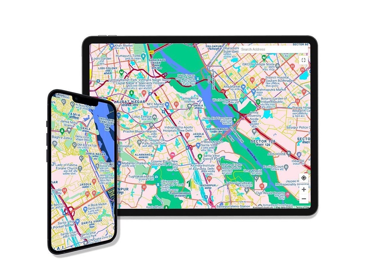
The final solution was to make Google Maps accessible. We re-designed Google Maps for three different types of colorblindness. This features new colors, saturation levels, better color contrast, and dynamic text resizing for increased accessibility.
OUR PROCESS
Competitive Analysis
Interviews
Persona and Scenarios
Ideation
Low-Fidelity Sketching
Implementation
Usability Testing
I. COMPETITIVE ANALYSIS
Products already exist in the market that aim to assist colorblind people. However, these required people to first identify themselves as colorblind. 50% of colorblind people are unaware of their condition, and hence continue living their lives through obstacles.
We wanted to understand techniques used by products that acted as assistive tools. We looked over a spectrum of products that varied in their features, technology used, and type of intervention. We finalized our top three picks as the most popular products across technological mediums-
Enchroma lenses provide color improvement to help users appreciate actual colors
A mobile app that helps users inspect colors in objects by scanning using their phone
A tangible device that helps users pick colors out of any product and display it on their mobile phones
Adds additional vibrancy to the colors.
Availability of variety of glasses for different colour blindness.
Different products are required to suit different lighting conditions
Has a color shift mode for personalisation.
It shows colours on a spectrum along with the name of the color.
Doesn't improve vision in a global sense.
Allows saving one’s favorite colors in the application.
Application helps view different colors.
Doesn’t provide immediate conversion due to app-dependency
II. SEMI-STRUCTURED INTERVIEWS
To understand the unique experiences of colorblind people in the world, I conducted semi-structured interviews with six colorblind participants. These helped us-
Understand awareness of and thoughts on market products
Understand areas they face navigational problems in due to colorblindness
Dependency on Communication
Exclusion from Social Experiences
Hinderance in Profession
Detachment from Society
Road tests and signs are not inclusive. The law does not permit colorblind people to get licensed to drive.
The green and red non-veg icon often comes without a descriptive label on packaged food.
One of our participants edited photos in monochrome because they were afraid of the potential blunders in the photo composition.
One of our participants did not realise if they were having a nephew or niece till someone told them that the colour of the balloons was pink.
One of our participants worked with multiple data visualisation tools for work. The default use of colour, or focus on aesthetics, leads to poor contrast, reduced visibility and hinders identification of colours.
One of our participants was always left out whenever the other two friends in their group of three went shopping. Their lack of color identification leads to mismatched outfits and poor fashion advice for their friends.
III. PERSONA AND SCENARIOS
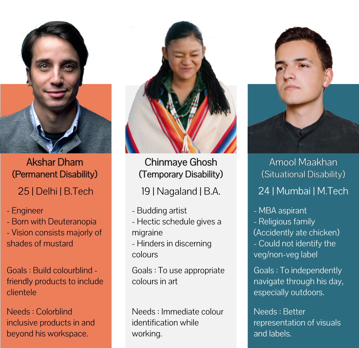
To make our learnings from the interviews more action-oriented, I used the findings to work on personas and related scenarios. The personas were designed for different types of disabilities. This was done to cater to the ‘design for one, extend to all’ concept when designing for disability. I wanted to ensure maximum usability of our solution.
IV. IDEATION
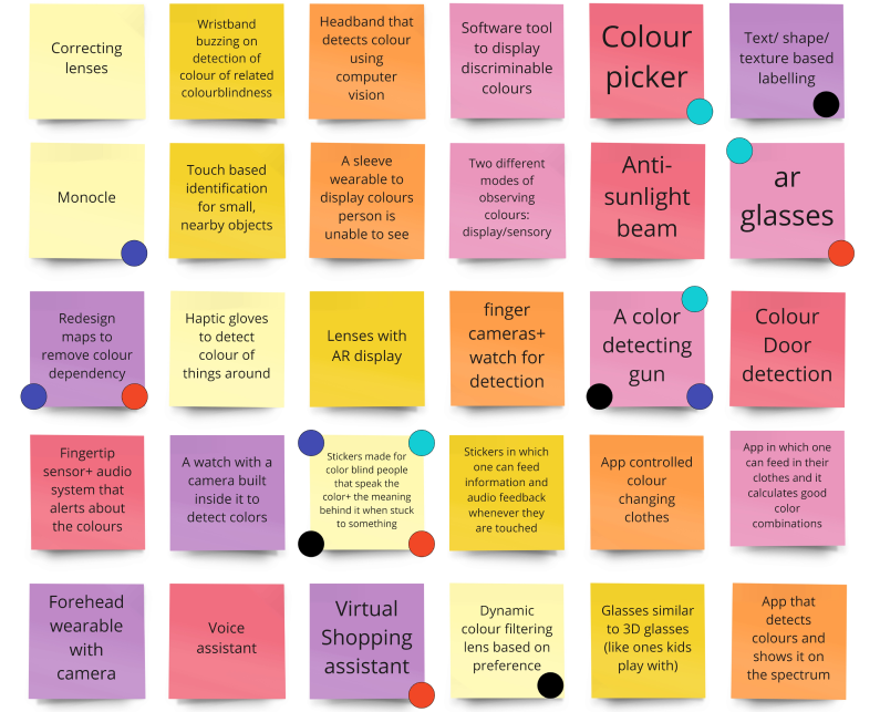
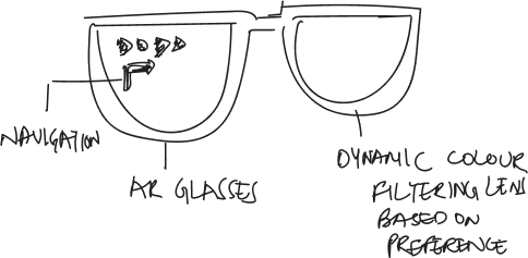
Based on our primary and secondary research, I led an ideation session on how we can work in the domain of independent living to assist colorblind people. My team and I engaged in brainwriting to generate ideas where we proposed solutions that were inspired by trends in technology like AR, virtual assistant, and oddly even the thermal screening gun used during the COVID pandemic!
Further, we used dot voting as a basis of idea selection, where each member voted for their top four ideas based on innovation.
V. LOW FIDELITY SKETCHING
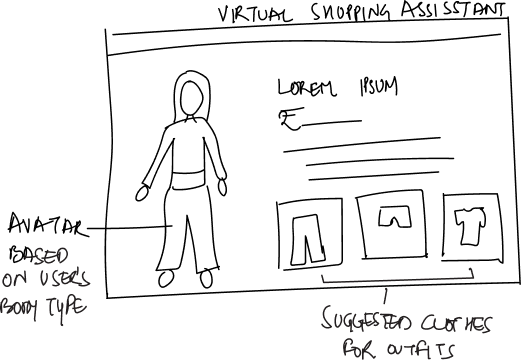
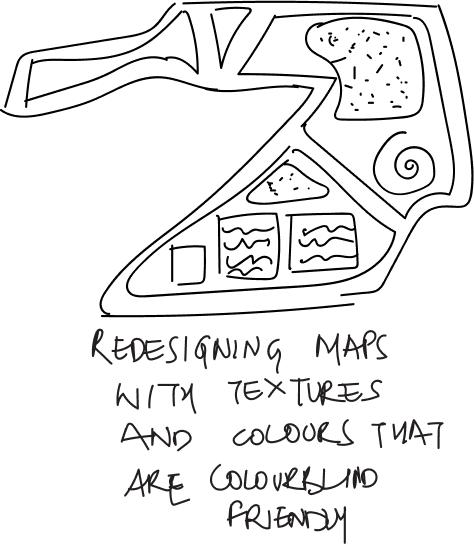
We took our top four ideas and quickly sketched low-fidelity prototypes to visualize how each may solve our problem statement. This gave us more clarity on how each idea may be implemented and which aligns best with our users. At the end, we sketched ideas that aided identification of colors and increased accessibility of products.
VI. IMPLEMENTATION: ACCESSIBLE GOOGLE MAPS
Adding another layer of selection to the ideas now, we voted for our top idea based on the feasibility and impact of the solution. The decision was unanimous- redesigning maps for accessibility.
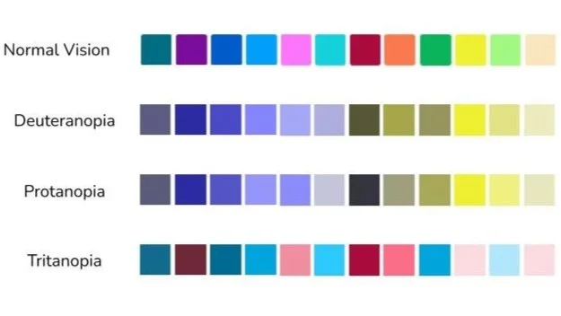
We focussed on adding accessibility features and the central aspect was the colour palette for the maps. We picked six colours from a template which could be easily distinguished by the three kinds of colour blindness and used them in our map.
Additionally, web accessibility guidelines suggest contrast ratio of text and background color should be 4.5:1. Since we were focussing on the colorblind-friendly map, we aimed to keep this ratio as high as possible and maintained the ratio above 7.5:1 for better accessibility.
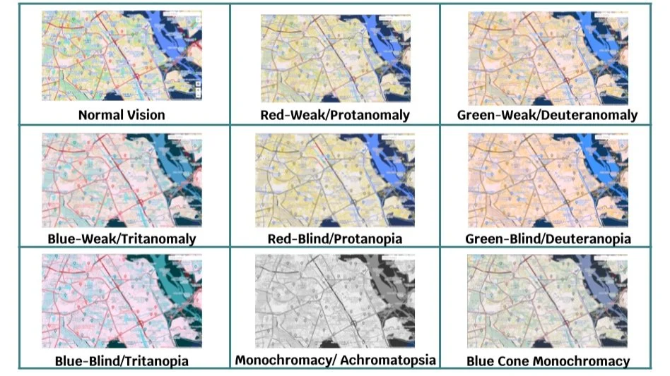
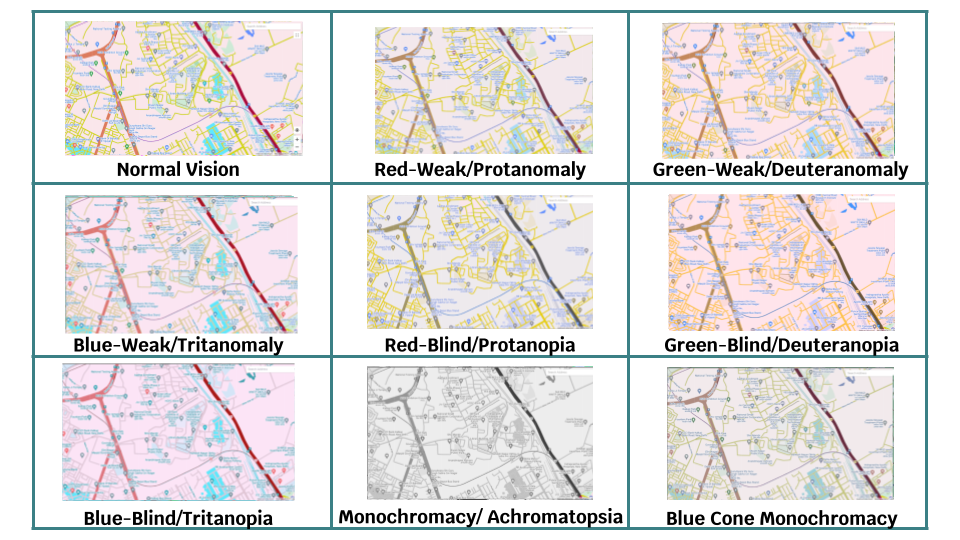
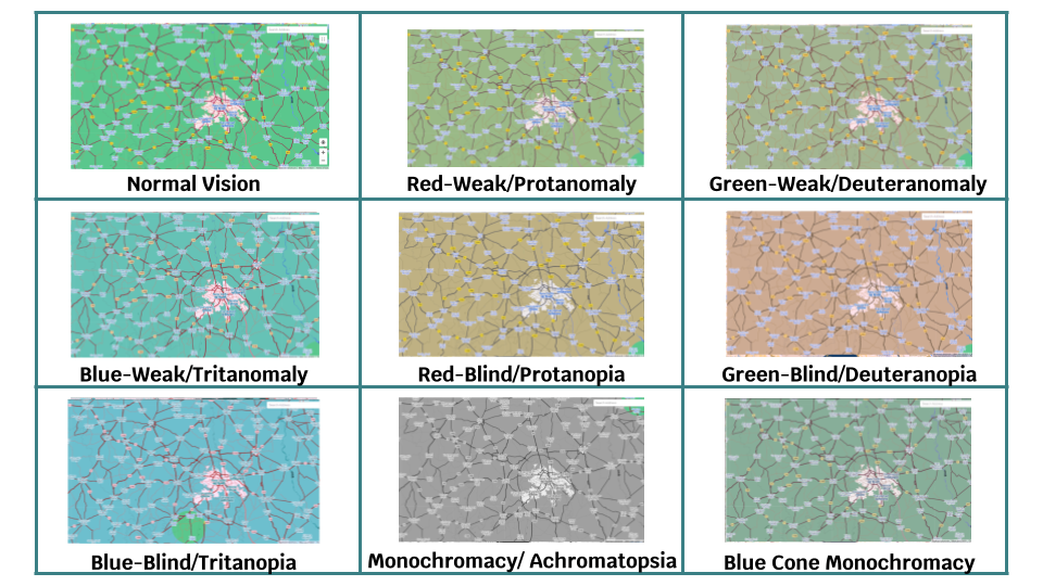
Our dynamic map additionally allowed the size of the text to be easily adjusted by zooming in. We implemented this using Map Style API from the Google Maps API and changed the colors, saturation, and lighting of various features in the map. An online simulator was used to display the map. To check the correctness of the map created, we used an online color blindness simulator to verify that the features we focused on were visible to the entire spectrum of color blindness. Here are some samples of accessible maps-
VII. USABILITY TESTING
Our solution took users from “I often find it difficult to use the data visualization tools due to the presence of multiple colors which are hard for me to identify” to “This new version makes me feel like I can identify things fast!“.
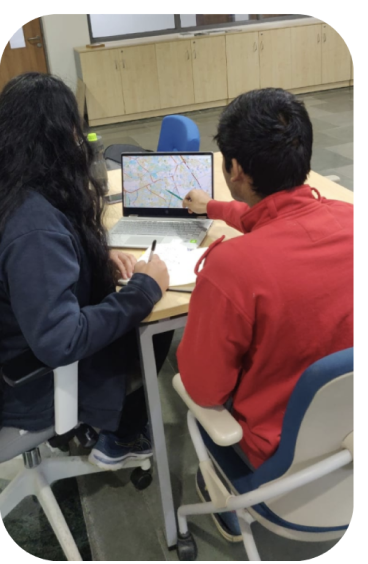
We received an overall positive response from the four users (same as interview participants) with whom we conducted our usability testing. They found this to be an improvement to Google Maps.
We received a suggestion to consider the representation of traffic conditions in maps, which is one of the primary concerns while checking maps during commutes. This can be a future direction for our idea.
PROJECT IMPACT
We uncovered how highly dependent we are on color for everyday navigation. This called to attention the need for accessible navigation. This insight is useful for designers of products, both digital and physical, policymakers, and educators among those responsible for ensuring equitable living for all.
We also brought to light the inaccessible nature of Google Maps, a widely used application, concerns in its use by colorblind users, and actionable suggestions for its improvement.
PROJECT LEARNINGS
The design process for inclusion has to be participatory. Being mindful of the human aspects of various excluded populations on the part of the researcher is essential, however, it is even more important to give excluded populations a voice in the process.
Being able to critique research and existing design solutions from inclusive design and accessibility perspectives.
Understanding accessibility- all of us may be excluded from products on occasion. A good design is mindful of different types of disabilities, ranging from situational to permanent, and designed for extendible use by all.


